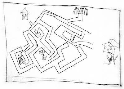
Just found my original sketch for this maze. I think it's fun to see the similarities from the beginning to the end. Not sure why I abandoned the bunny and beehive obstacles in the final...
Tuesday, December 28, 2010
Tuesday, December 21, 2010
Friendly Food- yum!
This summer I was asked to design a food label for Healthy Peninsula, a non-profit group that works to improve the health of the community in the Blue Hill peninsula and Deer Isle/Stonington area. This year they received a grant to work specifically with the community of Sedgwick to improve their eating habits. A lot of this work focuses on the school where there is a new serious greenhouse and cooking lessons for kids.
The goal of the "friendly foods" label is to create a recognizable symbol to mark foods that are healthy. Ideally this "logo" will be used in the school cafeteria, on recipes, and at food pantries, grocery stores and convenience stores. The tricky part is that the word "healthy" in the minds of the target audience possibly equals expensive, unappetizing, crunchy, pretentious, etc. So the solution was to use the word "friendly". This especially made sense because the biggest audience is the children at the elementary school. The hope is that these kids will learn to love the foods they cook and eat at school and that they will then encourage their parents to get the "friendly foods" at the store. This sounds a bit challenging, but I think it's a truly great idea and I'm very glad I'm involved.
The first use of the new resource came in October when stickers were made to put on root vegetable goodie bags given out at an event.
So this summer in the midst of carousing with friends and planning my mom's wedding I managed to come up with some concepts that eventually resulted in the following logos. The original word page was contributed by many people on various watercraft and pond-side locale. Note the varied writing media throughout the pages including a brown (?) magic marker. A big difficulty in coming up with plausible designs was that it couldn't really include any specific food or make reference even to vegetation (so tempting) since it could be used on meals and recipes and not just ingredients. The final design is friendly and approachable, but I hope also clean and beneficial.
Monday, December 20, 2010
Things I've been doing
This is what I've been doing, instead of paying attention to my blog:
Martha Speaks
I found and arranged winter animations for Martha Speaks. I get to go into the Flash files from the show and pull out relevant animations. I also made the fun little snow banks on the logos. Games menu redesign coming soon...
DotDiva
A very girly website for an initiative to get more girls involved in computing jobs. I did a bunch of simple designs for v2.0 including this profiles index page as well as the whole Parents and Educators section. That section was especially tricky because there was so much information!
Thursday, December 9, 2010
Busy busy
I've been so busy busy with my job and traveling that I've horribly neglected my newborn blog. No good at all... But I'll become a better blog-mom soon. I'm moving into a new place this weekend and I have great plans for settling, routines, and the like. Here's what kind of awesome stuff I've been working on:
Blogger, by the way, is not very receptive to animated gifs. I had to make a photobucket account and show the gif through that. Totally worth it.
Monday, November 15, 2010
My home is awesome...
Well, we all know that Maine is awesome, but now we have a award to prove it. Blue Hill and Deer Isle/Stonington were both recognized as being two of the six most imaginative communities in Maine. Above is the invitation I was asked to design for the Blue Hill award event. This area of Maine often get attention, but this award seems really special. It's not just highlighting some good places to eat or pointing out scenic vistas; it recognizes some of the truly important parts of the area. Looking at the list of consortium members is really incredible. I feel so lucky that I had to opportunity to be involved in or at least observed so many of these groups.
Monday, October 18, 2010
Patternification Continued...
Thursday, October 14, 2010
Friday, October 8, 2010
Autumn
Tuesday, October 5, 2010
a follow-up
Wednesday, September 29, 2010
The French
Tuesday, September 28, 2010
The Watermelon... Continued!
The object in my hand from last week's post was not a watermelon but a tomato- an heirloom tomato in fact! Last week at the Belmont Farmer's Market (every Thursday from 1:30 to 6) I became entranced by some beautiful heirloom tomatoes from Kimball Fruit Farm. I was struck with an epiphany! I snatched up a variety of the beauties and created a fun little game. Enjoy!
The Blue Hill Fair
Subscribe to:
Posts (Atom)